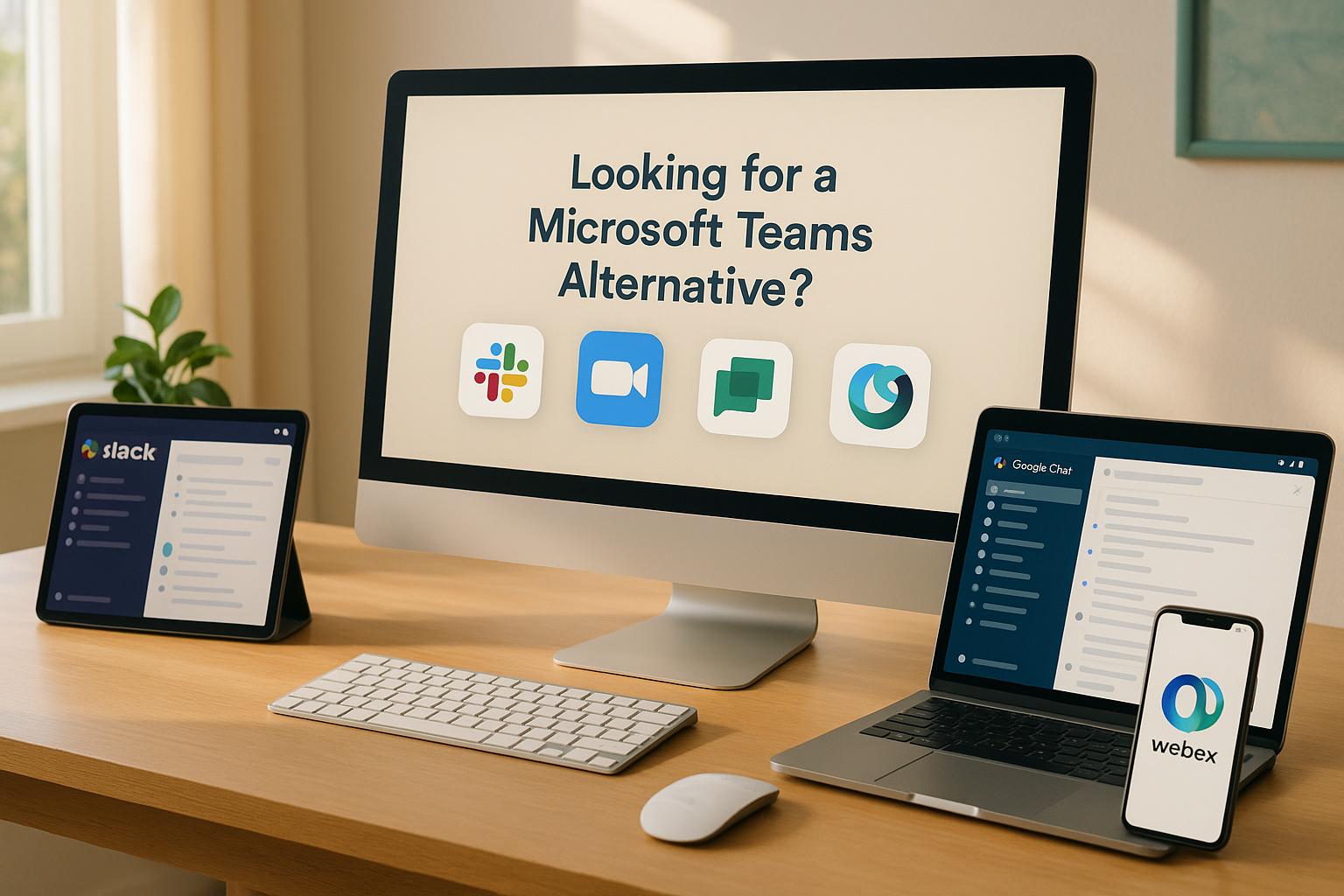
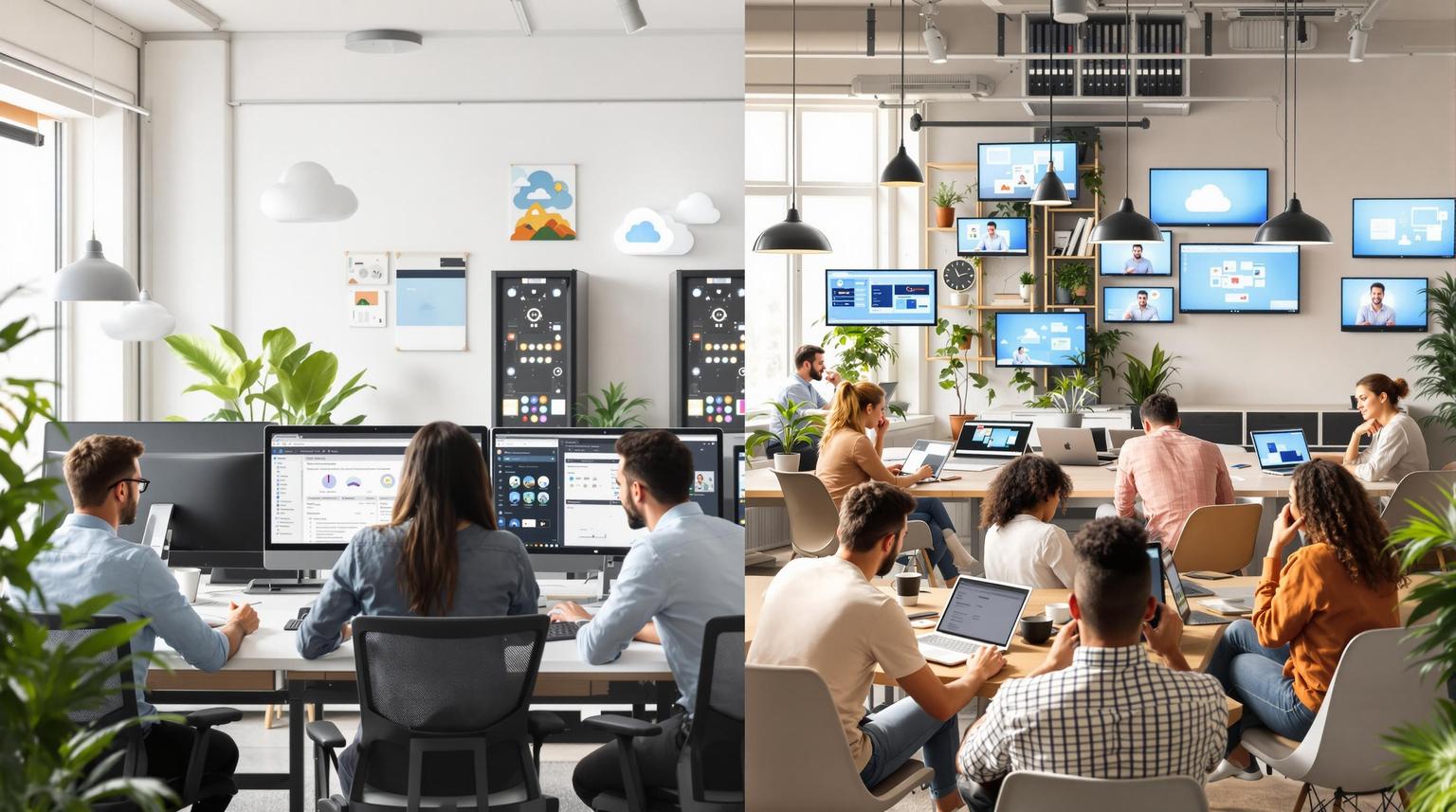
Ultimate Guide to Customizing Team Chat Interfaces

Team chat platforms are more than just tools for communication - they can be tailored to improve how you work. Here’s a quick breakdown of what you’ll learn:
- Personalization Basics: Change colors, themes, and layouts to suit your style or brand.
- Advanced Customization: Use CSS and APIs for deeper control, like automating workflows or tweaking designs.
- Accessibility Features: Adjust text sizes, colors, and navigation for an inclusive experience.
- Security Settings: Manage permissions and integrate compliance tools to keep data safe.
Whether you’re looking to improve usability, reflect your brand, or ensure accessibility, this guide covers everything you need to know.
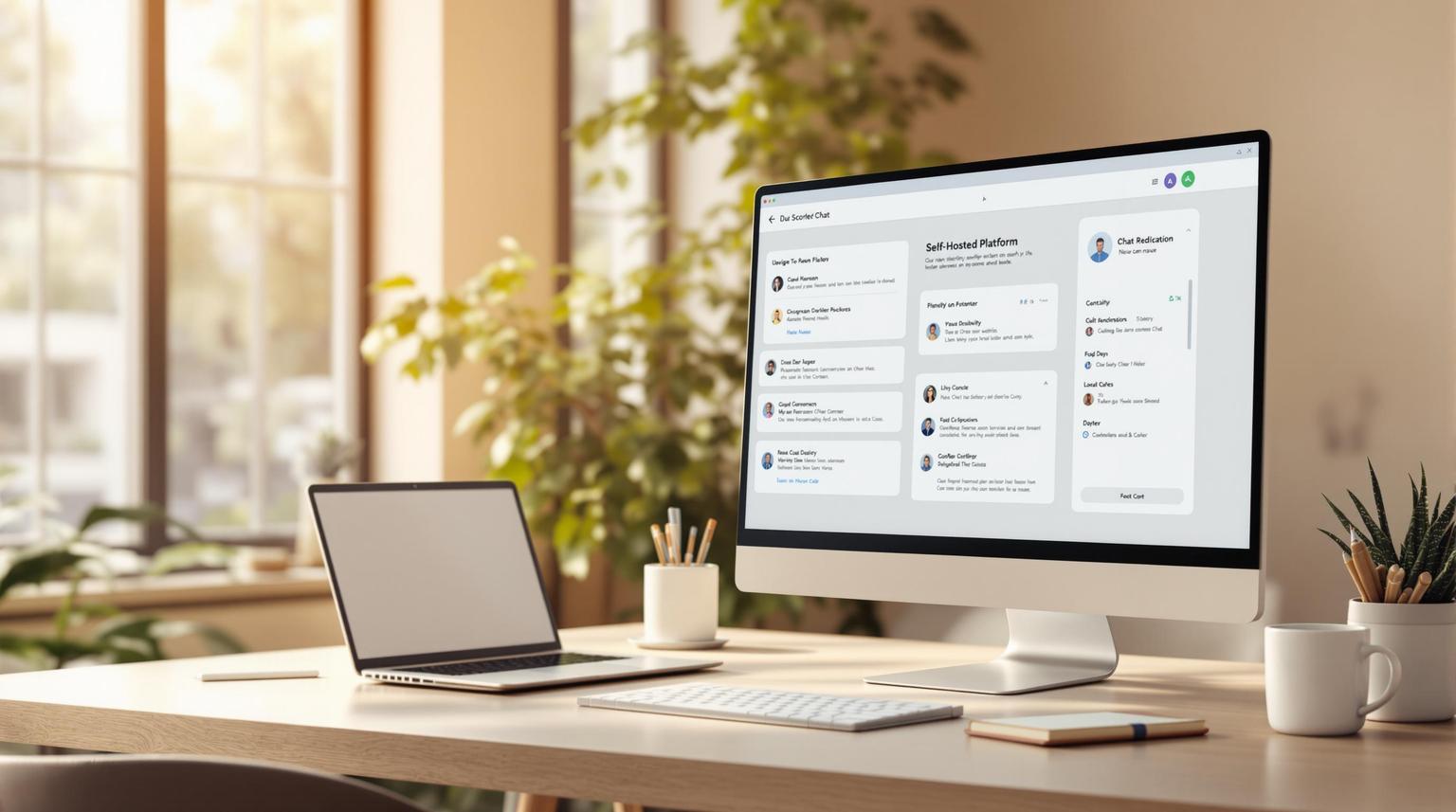
Customisation Features on Microsoft Teams
Basic Interface Customization Elements
You can fine-tune your team chat interface by tweaking a few key elements, creating a workspace that feels just right. These foundational adjustments pave the way for more advanced personalization down the line.
Colors and Visual Themes
Visual elements are more than just aesthetics - they shape how productive and comfortable you feel. Here are a few ways to make the interface your own:
- Light and Dark Modes: Switch between these modes depending on your lighting environment or personal taste.
- Brand Colors: Use your organization's color scheme to maintain a consistent look across platforms.
- Custom Themes: Personalize specific parts of the interface, like message bubbles, headers, or sidebars, to suit your style.
Workspace Layout Settings
A well-organized workspace can make all the difference. Here are some layout tweaks to consider:
- Group channels into custom categories for departments or projects.
- Pin high-priority channels to the top of your sidebar for quick access.
- Use standardized channel names to make searching easier.
- Hide or display sections based on what’s most relevant to your team.
- Adjust the width of the sidebar to fit your preferences.
- Rearrange elements to match how you work best.
Alert and Status Settings
Managing notifications is key to staying focused without missing important updates. Fine-tune your alert and status settings to strike the right balance between staying connected and avoiding distractions.
Start with basic adjustments that fit your daily routine, and tweak them further as your needs evolve.
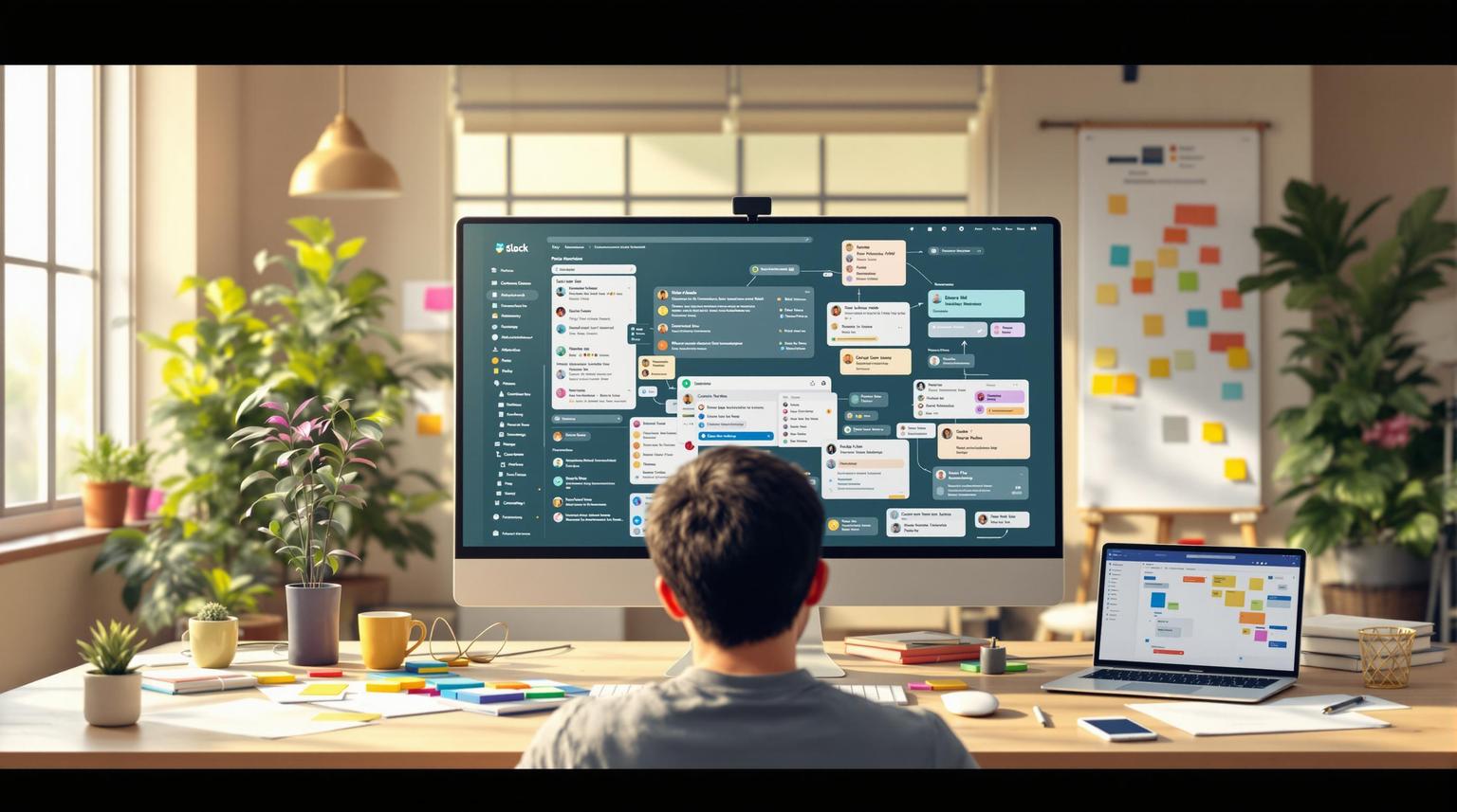
Technical Customization Tools
Advanced tools allow you to shape your chat interface to fit your specific needs, offering control over both the visual and functional aspects of your workspace.
CSS and API Options
With custom CSS, you can tweak the visual presentation of your interface. This lets you adjust everything from colors to layout spacing, ensuring the design aligns with your team's preferences or branding. Here are some common CSS adjustments:
- Change background colors to improve contrast and readability.
- Adjust fonts and spacing for a cleaner, more organized look.
- Modify sidebar widths and padding to streamline navigation.
For those with a development background, APIs take customization to the next level by enabling the creation of custom workflows and integrations. Here are a few ways APIs are commonly used:
| API Use Case | Advantage |
|---|---|
| Custom Bots | Automate repetitive tasks and send alerts. |
| Data Display | Embed external metrics directly into the chat. |
| Channel Management | Automatically structure and organize channels. |
| Status Updates | Sync with project management tools for updates. |
While CSS and API customizations offer powerful control, they do require technical expertise. For those who prefer a simpler approach, personal settings and templates provide an easy-to-use alternative.
Personal Settings and Templates
Not all customization requires coding. Many modern chat platforms include intuitive personal settings that allow users to create and apply their preferred layouts effortlessly.
Key Template Features:
- Save custom layouts for different projects.
- Standardize channel structures for team consistency.
- Store notification preferences to reduce distractions.
- Set up recurring meeting templates for regular events.
Templates can also be tailored to specific roles. For instance, developers might use a compact layout with deployment notifications, while marketing teams could opt for a visual-heavy setup featuring campaign metrics.
These tools make it easy for users to personalize their chat experience, letting them adjust chat density, save preferred layouts, and apply ready-made themes - all without needing technical skills.
Tips for Effective Customization
- Always test custom code in a sandbox environment before implementing it.
- Keep a record of your changes for future reference.
- Back up your customization files to avoid losing work.
- Stay informed about platform updates that might affect your customizations.
- Follow security guidelines when using API integrations.
Making Interfaces More Accessible
Designing a chat interface that everyone can use isn’t just about ticking boxes - it’s about fostering meaningful collaboration while meeting WCAG standards.
Text and Color Accessibility
For users with visual impairments, clear and readable text with proper contrast is essential. Here’s how to make text and color settings more accessible:
| Accessibility Element | WCAG Requirement | Suggested Implementation |
|---|---|---|
| Color Contrast | Minimum 4.5:1 ratio | Use dark text on light backgrounds or light text on dark backgrounds |
| Font Size | Base size of 16px | Allow scaling between 14px and 24px |
| Text Spacing | Line height of 1.5x | Enable adjustable spacing options |
| Color Blindness | Use multiple visual cues | Combine colors with patterns or symbols |
To further enhance accessibility:
- Adjustable font sizes that scale proportionally across the interface.
- High-contrast themes with customizable color palettes.
- Consistent heading styles to establish a clear visual hierarchy.
- Alternative text indicators for crucial status updates or messages.
However, accessibility doesn’t stop at text and color. Seamless keyboard navigation and screen reader support are equally critical.
Keyboard and Screen Reader Features
A well-designed interface should offer logical navigation and clear audio feedback, making it easier for users relying on assistive tools. Here’s what to focus on:
Keyboard Navigation:
- Customizable shortcuts: Let users define their own keyboard shortcuts for efficiency.
- Focus indicators: Highlight the currently selected element with a visible outline.
- Skip navigation links: Provide quick access to primary content areas.
- Command palette: Enable access to all functions using keyboard commands.
Screen Reader Support:
- Use ARIA labels for all interactive elements to describe their purpose.
- Include descriptive headings to guide users through different sections.
- Provide status announcements for real-time updates like new messages or alerts.
- Add alternative text for images and emojis to ensure nothing gets missed.
To illustrate, here’s how the interface might interact with screen readers:
| Action | Keyboard Command | Screen Reader Feedback |
|---|---|---|
| New Message | Ctrl + N | "New message window opened" |
| Switch Channel | Ctrl + K | "Channel list activated" |
| Search | Ctrl + F | "Search field focused" |
| Navigation | Tab/Arrow Keys | "Moving through messages" |
These features shouldn’t be afterthoughts - they need to be part of the core design. Regular testing with real assistive technology users ensures these tools work as intended in practical scenarios. By prioritizing accessibility, you create a foundation for a user-friendly and inclusive interface, paving the way for the next topic: secure interface settings.
sbb-itb-ae976f1
Security Interface Settings
Enhancing your platform's security goes hand-in-hand with customization and accessibility. By fine-tuning permission settings and integrating compliance tools, you can ensure the platform meets both organizational needs and regulatory requirements.
Permission-Based UI Controls
The platform's interface adjusts dynamically based on user roles, ensuring that individuals only see and access what their permissions allow. This role-based approach simplifies navigation while safeguarding sensitive features.
Key Permission Levels:
| Permission Level | Accessible UI Elements | Restricted Elements |
|---|---|---|
| Administrator | Full settings panel, user management, compliance tools | None |
| Team Lead | Channel creation, member invites, analytics | System settings, compliance tools |
| Regular User | Messaging, file sharing, reactions | Admin panel, user management |
| Guest | Limited channel access, basic messaging | Settings, member list, file storage |
To make role-based controls more effective:
- Use role badges to clearly identify permissions.
- Add tooltips to explain restricted features.
- Offer immediate visual feedback for unauthorized actions.
- Keep permission indicators visually consistent across the interface.
Once role-based access is in place, make sure your compliance measures are just as clear and accessible.
Compliance Visual Indicators
Compliance indicators are essential for maintaining regulatory standards without overcomplicating the interface. These visual cues provide real-time updates on the security and compliance status of conversations and data.
Important Compliance Indicators:
| Indicator Type | Visual Element | Purpose |
|---|---|---|
| Data Classification | Color-coded badges | Highlights the sensitivity level of shared data |
| Retention Status | Timeline icons | Shows how long messages are stored |
| Monitoring Notice | Banner alerts | Informs users that conversations are being recorded |
| Encryption Status | Lock icons | Confirms end-to-end encryption is active |
To integrate these indicators effectively:
- Use universally recognized symbols for clarity.
- Apply consistent color schemes to represent security levels.
- Position indicators subtly to avoid clutter while keeping them noticeable.
- Provide hover-over explanations for symbols to enhance understanding.
For industries with strict regulations, combining permission-based controls with compliance indicators creates a secure and intuitive user experience. Striking the right balance between visibility and simplicity is crucial to achieving both security and ease of use.
Summary
This overview pulls together important details about customization, accessibility, and security in modern platforms, showcasing how they work seamlessly across desktop, web, and mobile environments.
Core Interface Elements
Customization starts with chat density settings, giving users the flexibility to tailor their experience. Here’s a quick breakdown:
| Density Mode | Advantages | Ideal For |
|---|---|---|
| Compact | Displays more messages, saves screen space | Monitoring high message volumes |
| Comfy | Easier on the eyes, improves readability | Long chat sessions |
Workspace Organization
A well-organized workspace is key to boosting productivity. Platforms allow users to:
- Rearrange priority items using drag-and-drop functionality.
- Collapse or minimize sections to reduce on-screen clutter and maintain focus.
Technical Features and Accessibility
Modern chat platforms are designed with inclusivity in mind. Features like keyboard navigation, screen reader support, customizable color schemes, and consistent functionality across devices ensure accessibility for all users.
Security and Compliance Integration
Customization doesn’t stop at aesthetics - it also supports security. Here’s how customization integrates with key security features:
| Feature | Purpose | How It’s Shown |
|---|---|---|
| Role Badges | Highlights user permissions | Uses color-coded markers |
| Compliance Indicators | Displays regulatory compliance | Shown as icons or badges |
| Encryption Status | Indicates security levels | Represented by lock symbols |
FAQs
How can I customize my team chat interface using CSS and APIs?
Customizing your team chat interface using CSS and APIs lets you shape a workspace that feels more aligned with your team's style and workflow. With CSS, you can tweak visual elements like colors, fonts, and layouts to better reflect your brand or personal preferences. Meanwhile, APIs open the door to adding extra features, automating repetitive tasks, or seamlessly connecting your chat platform with other tools your team relies on.
To dive in, first check if your chat platform supports custom CSS or provides developer-friendly APIs. Many platforms include detailed guides to walk you through the process. Whether you're fine-tuning the look or building deeper integrations, these tools let you craft a chat interface tailored specifically to your team's needs.
How can I make my team chat interface more accessible for users with disabilities?
Making Your Team Chat Interface Accessible
Creating an inclusive team chat interface means ensuring everyone, including users with disabilities, can use it effectively. Here are some practical steps to consider:
- Keyboard navigation: Make sure users can move through the interface using just a keyboard. Highlight selected elements clearly to guide navigation.
- Screen reader compatibility: Use proper labels and ARIA (Accessible Rich Internet Applications) roles so screen readers can accurately interpret the interface.
- High-contrast themes: Provide themes with strong contrast between text and background colors to make content easier to read for users with visual challenges.
- Text alternatives: Add descriptive alt text for images and provide captions for videos to support users with visual or hearing impairments.
Focusing on these areas ensures your platform is welcoming and functional for everyone, boosting teamwork and efficiency.
How do permission-based UI controls enhance the security of a team chat platform?
Permission-based UI controls are essential for keeping a team chat platform secure. By tailoring access to features and information based on user roles, these controls help block unauthorized actions, like accessing sensitive data or making changes meant for administrators.
For instance, regular team members might only see tools and options relevant to their responsibilities, while administrators have access to manage settings and permissions. This approach not only reduces the chances of accidental mistakes or intentional misuse but also ensures a safer and more structured environment for collaboration.